Most e-commerce platforms have a standard layout. Their product pages are fairly similar, with content arranged from left to right and a dominant image. Call-to-actions almost always appear at the top, especially on mobile devices. You can optimize for sales and improve your product pages.
The norm is not always the most effective. Brands that understand their audience can go against the grain and take advantage of hidden opportunities to motivate visitors, resulting in more conversions in return.
Let us look at three online stores that move away from the standard product page design.
Bird Rock Coffee Roasters - they know what matters to customers. They provide important information above the CTA, both on desktop and mobile devices - sharing information about the altitude, which is a factor in product quality (correlates with acidity), and the roast level of the beans. This data motivates buyers to make a purchase decision. Bird Rock understand that coffee drinkers are picky and value specifications before price.
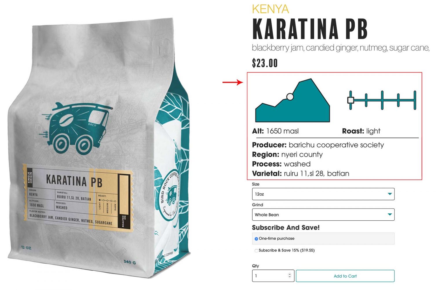
A product page showcasing Bird Rock coffee, with a diagram for altitude and roast level.
You may find the product feature before the CTA - yes, that makes sense if it encourages visitors to make a purchase.
Source: Bird Rock Coffee Roasters.
The image above is a desktop view. Usually in mobile view, shoppers have to scroll two or more screens to reach the CTA. Not here, when we look at the Bird Rock site. Even on mobile devices, you will find the most important details before the CTA, reducing the need for shoppers to look for answers elsewhere.
–
Nixon, a lifestyle accessories brand, has created a different experience for users on mobile and desktop devices. On desktop, they highlight product images in the center of the page, between the description and the CTA. On mobile devices, the main image is shown first, followed by the product options, an add-to-cart button, and the description.
The desktop view makes reading left to right easier by showing key purchase benefits. Both views provide thumbnail images of each variant, which help speed up the selection of specifications such as color and material configuration.

The Nixon product page features a large image of a stylish watch
The desktop layout uses three columns and allows Nixon.com to emphasize the main product images.
–
Gymshark, which sells fitness apparel and accessories, focuses on product images. On desktop, grids of photos (and sometimes videos) take up the entire left side. On mobile devices, the thumbnails are large enough to highlight every detail. With a fixed CTA on mobile devices, shoppers only need to look at the bottom of the screen and add the product to their cart.
Automatically showing additional images with easy zoom reduces clicks and scrolling, lowers bounce rate, and optimizes conversions.

What excites shoppers?
Millions of eCommerce sites look eerily similar. Merchants need to consider the desires and behavior of their audience in order to stand out from competitors. Heatmaps & clickmaps - tracking maps can provide valuable insight into where visitors lose interest.
Detailed analytics show us specific points where the conversion process breaks down.
Rebuilding product pages requires a balance between design, functionality, and user expectations. The type of products determines every detail.
Any company that offers lifestyle products faces different challenges compared with companies that sell power tools.
When designing your product pages, consider:
The primary and secondary product images. Highlight those that stand out at first glance and provide additional context for the messaging.
Data drives the purchase decision. Everything presented above the CTA should help the shopper make a positive decision. For example, with clothing it is important to show the quality of the materials used, the product origin, unique features, and available sizes. For coffee specifically, acidity and roast level matter. Not all products need emphasized information at the top, so assess each case individually.
Time-saving features and actions. The best layouts highlight important information concisely in fields with plenty of whitespace around them. Keep in mind that pop-ups also require attention and additional actions.
How the people browsing your products make decisions. Some buy wallets based on functionality; others evaluate price or fashion trends. You can use any information that may influence the audience to choose your product, as long as you understand it.
Do not be afraid to experiment with different product page variations. Start by inviting loyal customers to share their opinions about the existing layouts. Then move on to live A/B tests. Keep detailed notes and annotate your analytics tools.